Introduction:
Reaching perfection in the field of beverage label design is hard. However, labeling can be difficult. Mistakes, which we are going to discuss in this blog, can ruin great designs.
In this guide, we’ll highlight these mistakes and provide useful tips to prevent them. With Kwality Labels, you can truly become a pro at designing beverage labels. When it comes to designing beverage labels, it’s crucial to avoid five common Label Design Mistakes that can detract from your brand’s appeal and draw in customers. And for the best label printing service to bring your designs to life, Kwality Labels is unmatched.
Top 5 Label Design Common Mistakes to Avoid:
Labeling plays a vital role in presenting products and promoting them. Whether you’re selling drinks or something else, the label is really important for getting people interested and telling them what they need to know.
However, creating beverage labels demands close attention to details to make them work well.
In this guide, we’ll examine five common mistakes to avoid when creating beverage labels, guaranteeing that your products stand out on store shelves and attract customers’ attention.
1 Ignoring Brand Identity:
- Neglecting brand identity in beverage label design can be a critical misstep. Your brand identity comprises everything unique about your brand, such as its logo, colors, personality, and values. It’s essential to ensure that design beverage labels reflect effectively and reinforce your brand identity
- Not doing this can confuse shoppers and reduce how well your brand is remembered. Having and maintaining a consistent brand identity helps customers connect with your products
- To prevent this error, make sure to include your brand’s logo, colors, and other visual elements prominently in your label design. Making sure that all branding materials remain consistent is crucial for creating a strong and easily recognizable brand image.
- Moreover, think about how your label design matches your brand’s beliefs and messages. Are you presenting your products as environmentally friendly or high-end? Your label design should communicate these qualities clearly to resonate with your target audience.
- Neglecting brand identity in designing beverage labels can hold back your brand from standing out in a crowded market and building strong connections with consumers.
2 Overcrowding the Design:
Stuffing too much into your beverage label design is a no-go. It’s tempting to cram in all the info you can, but overcrowding makes it hard for customers to focus. When there’s too much happening, important details get lost in the shuffle. Plus, a cluttered label looks messy and unprofessional, turning people off instead of drawing them in. Instead, keep it simple and clear. Highlight the key info like the product name, ingredients, and maybe a catchy slogan. Leave some breathing room so everything stands out nicely. Remember, less is often more when it comes to design. A clean, uncluttered label makes a better impression and helps customers understand your product quickly. So, resist the urge to overcrowd, and let your beverage label shine with simplicity and style.
3 Poor Readability and Legibility:
Making beverage labels hard to read is a mistake. If customers can’t easily read the label, they might not understand what they’re buying. This can lead them to choose a different product instead. It’s important to use clear fonts and colors that stand out from the background. This ensures that the information on the label is easy to see and understand. Additionally, overcrowding the label with too much text or graphics can make it difficult for customers to focus on the important details. By keeping the design simple and straightforward, you can improve readability and legibility. Overall, ensuring that your beverage labels are easy to read is essential for attracting customers and making sure they have a positive experience with your product.
4 Lack of Compliance:
Neglecting compliance in beverage label design is a critical blunder. It involves not adhering to the necessary regulations and standards set forth for labeling products, which can have serious consequences for businesses. These regulations cover aspects such as listing ingredients, providing accurate nutritional information, and displaying appropriate health warnings or certifications. Failing to comply can result in legal issues, fines, or even damage to a brand’s reputation. Additionally, it can lead to consumer mistrust and dissatisfaction if they feel misled or uninformed about the product they’re purchasing.
To avoid this mistake, businesses must stay updated on the relevant labeling laws and guidelines in their target markets. Working with professionals, such as label printing services, can also help ensure that designs meet compliance standards. By prioritizing compliance in beverage label design, businesses demonstrate their commitment to transparency, safety, and consumer trust, ultimately enhancing their brand reputation and market credibility.
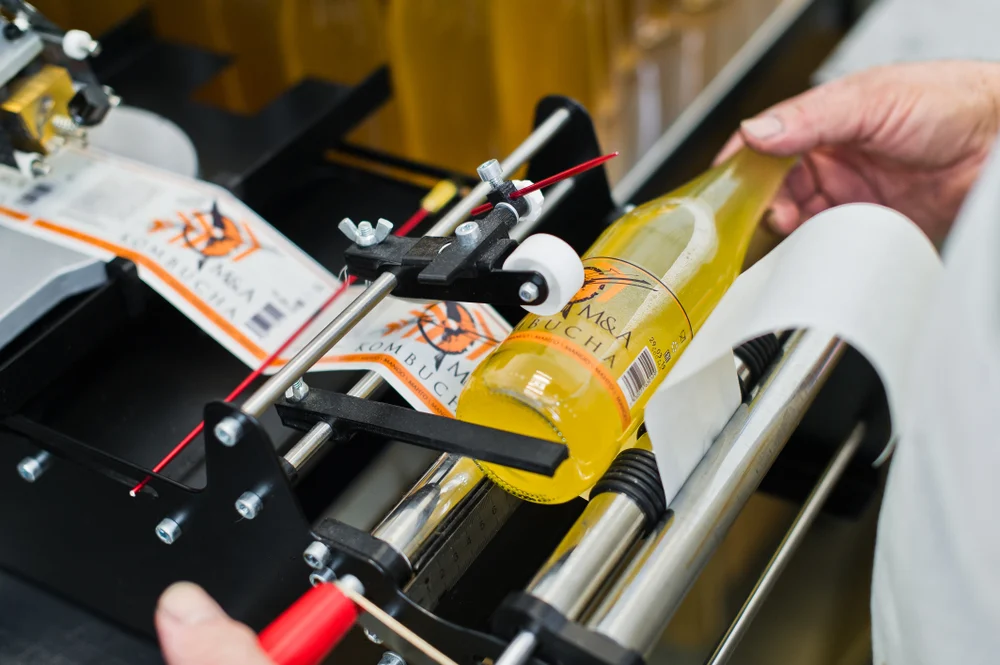
5 Neglecting Print Quality:
Ignoring print quality in beverage label design is a big no-no. The way your label looks when it’s printed affects how customers see your product. If the print quality is poor, with blurry images or smudged text, it makes your product seem unprofessional. Customers might think twice about buying it because it doesn’t look good. To avoid this Label Design Mistakes, make sure to work with a good printing service that uses high-quality materials and modern printing technology. This ensures your labels come out clear and sharp, making your product stand out on the shelf. Remember, the quality of your label reflects the quality of your product in the eyes of the consumer. So, investing in good print quality is crucial for making a positive impression and boosting sales.
Conclusion
In the competitive world of beverage sales, Kwality Labels sets the standard for excellence in label design and printing. With our expertise and dedication to quality, we help brands elevate their presence on the shelves and captivate consumers’ attention. From concept to creation, we work closely with clients to craft beverage labels that embody their brand identity, comply with regulations, and stand out amidst the competition. With Kwality Labels, your beverages aren’t just products – they’re works of art, meticulously designed to inspire desire and delight.